This book is moving fast now: we’re looking at publishing early this fall. It’s time for us to think about what the book will look like and we can use your help.
As a reward for following this substack, I’m inviting you to help us decide the cover design direction - Woohoo!
We think a good cover has the following attributes:
The title should be easily readable in thumbnail
The book is easily identifiable 10 feet away
It has one strong visual concept (making related branding easier)
Be funny/irreverent if possible, in a way appealing to designers
Bonus if it looks good with How Design Makes The World (the prequel to this book)
How to help us
These are just concepts to get the idea across - not finished designs. Of course it’s hard to judge what isn’t here, but keep in mind the possible iterations (and suggest some if you have a good idea for us).
Vote for the one you think has the most potential. And if you think they all stink and you have a better concept you want us to consider, describe it in the comments.
If you’re just stopping by, subscribe to follow along as the project progresses.
Concept A
This is a riff on design work: how someone is always leaving notes and comments on the work that we do. There could be some inside jokes on the whiteboard, or possibly some of the ideas from the book itself. This attempt is a bit bland as is, but has potential.
Concept B
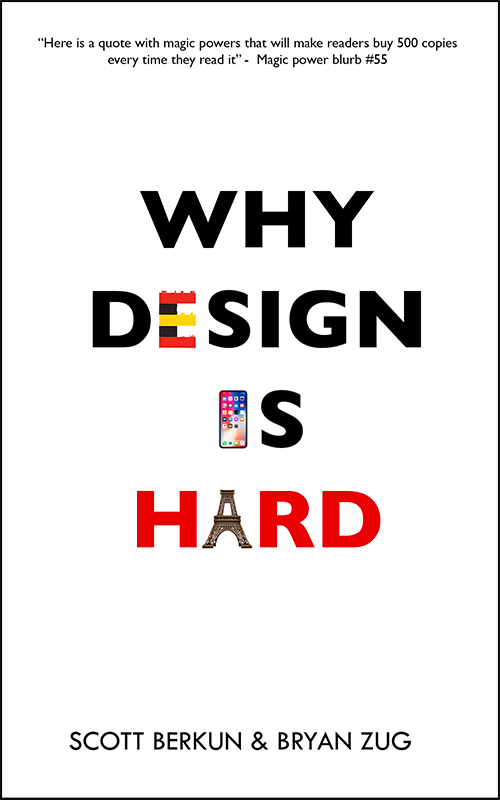
Why Design is hard is a semi-sequel to How Design Makes The World, my last book. This is it’s cover.
It makes sense to try try a design that riffs off the same visual elements. There aren’t as many words in the title for Why Design Is Hard, so it needs help: too much whitespace and it feels like it wants different typography - but to illustrate the concept you get something like this.
Concept C
This is an attempt at a kind of visual joke: vertical text is harder to read, so what if we made a design that’s sort of interesting in a graphic design student way, but is compelling enough to hold your eye and make the point that design is hard.
Concept D
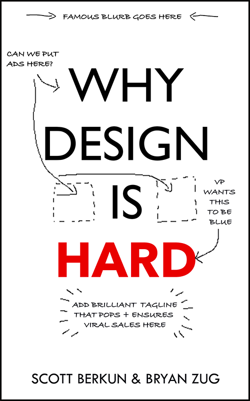
Another attempt at bringing visual humor to the concept of the book. The idea is that the “leadership team” has various absurd requests for what the design needs to do, and they are actually part of the cover.
Do you have suggestions?
If you’re on this list you’re probably a designer and designers LOVE to offer opinions, right? What thoughts or ideas do you have for us? Leave us a comment. Thanks.


A repeats the sticky cliche that doesn’t really say anything more.
B sounds good but I feel the sequel doesn’t fit the vibe of the first book.
C is a good concept but it becomes hard to read. How about making it even harder to read to make a point?
D hits on the humour right on and I assume EVPs might also want to take the credit as coauthors LOL!
C & D both made me laugh and are memorable, but the design of C really is too hard to read.