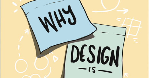
Hi folks. Thanks to all 150+ of you who voted on the first round of cover design concepts. If you’re new here, read this quick FAQ to learn what the book is about.
We took your input to heart and debated, brainstormed, ruminated and incubated… and now we’re back with another, and likely near final, set of choices for your review.
We brought in designer Tash Wilcox to put together these revised and new concepts for us. Take a look and vote at the bottom.
CONCEPT A
This is a more fleshed out version of Concept A from round 1. And yes, we know my name is misspelled here: hmmmm, this might be an advantage for me if everyone hates this book when it comes out.
CONCEPT B
CONCEPT C
This is a deeper dive from Tash on my idea from Concept D in round 1.
TELL US YOUR VOTE
It’s time to decide the fate of our book. Which cover concept is the best one? We think a good cover has the following attributes:
Simple, memorable, and makes an impression
The title should be easily readable in thumbnail
The book is easily identifiable 10 feet away
It has one strong visual concept (making related branding easier)
Be funny/irreverent if possible, in a way appealing to designers
Bonus if it looks good with How Design Makes The World (the prequel to this book)
Have opinions?
We’re closing in our final design. Feedback is welcome, but we’re mostly looking for tweaks or refinements that would improve these concepts rather than finding new concepts to try. Thanks.


C but with fewer corrections. The three “HARD” is 2 too many. We get it from the other stuff..
I like C, but it looks like you just quickly scaled the same marker lines. You need to print it out, then use a real Sharpie and photograph that. If design grad school taught me one thing, it is you have to do it for 'real'.